DATA
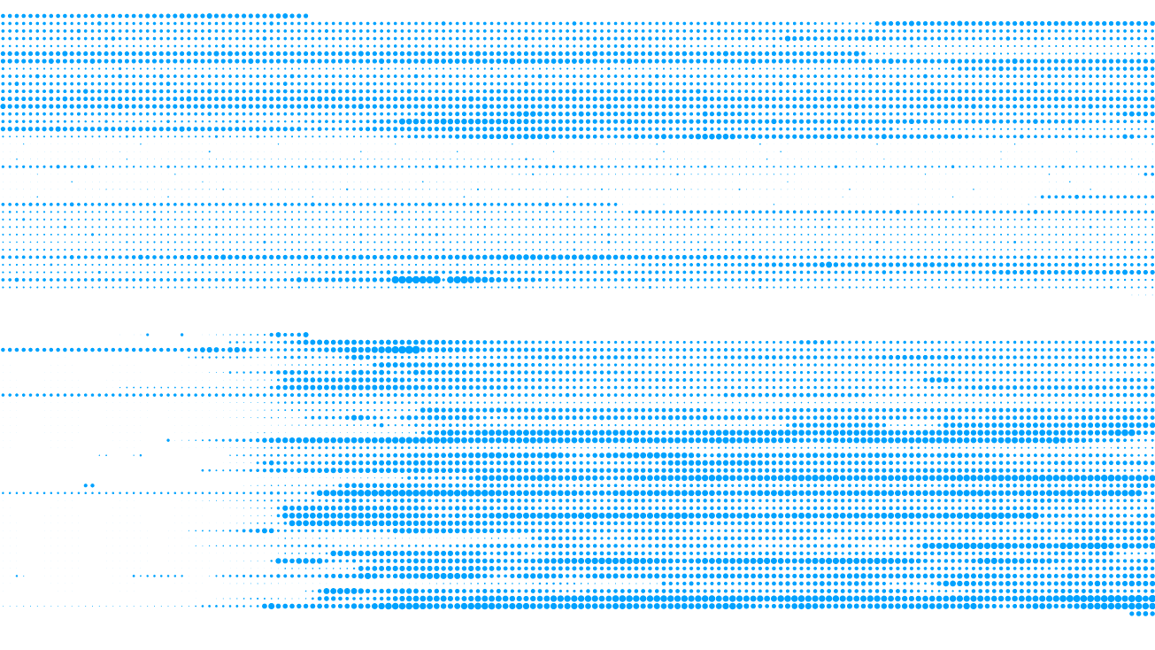
Data comes from a meteo api, for bordeaux city / france.
VISUALIZATION ENCODING
Each circle is one hour of data. Each column is one day. Circle size is related to metric value.
VISUALIZATION INTERACTION
No interaction for this visualization. Data is static.
TECHNOLOGIES
html, css, javascript, d3js, nodejs, http api calls.
STORY
A very aesthetic visualization. Each dot is the temperature. Each vertical line a day and each horizontal line an hour.
We notice the temperature is higher during the day. When the temperature is up during a day or more we notice higher values even at night.
This visualisation has no text no legend. Its closer to data art and i really love working with kind of circles.