DATA
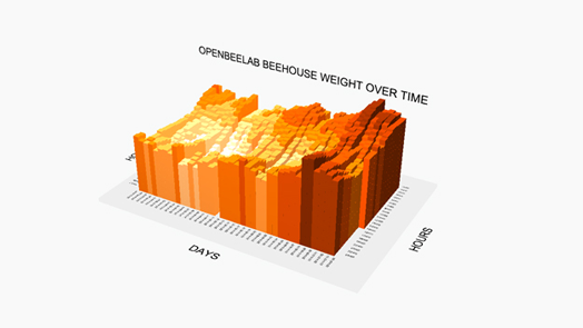
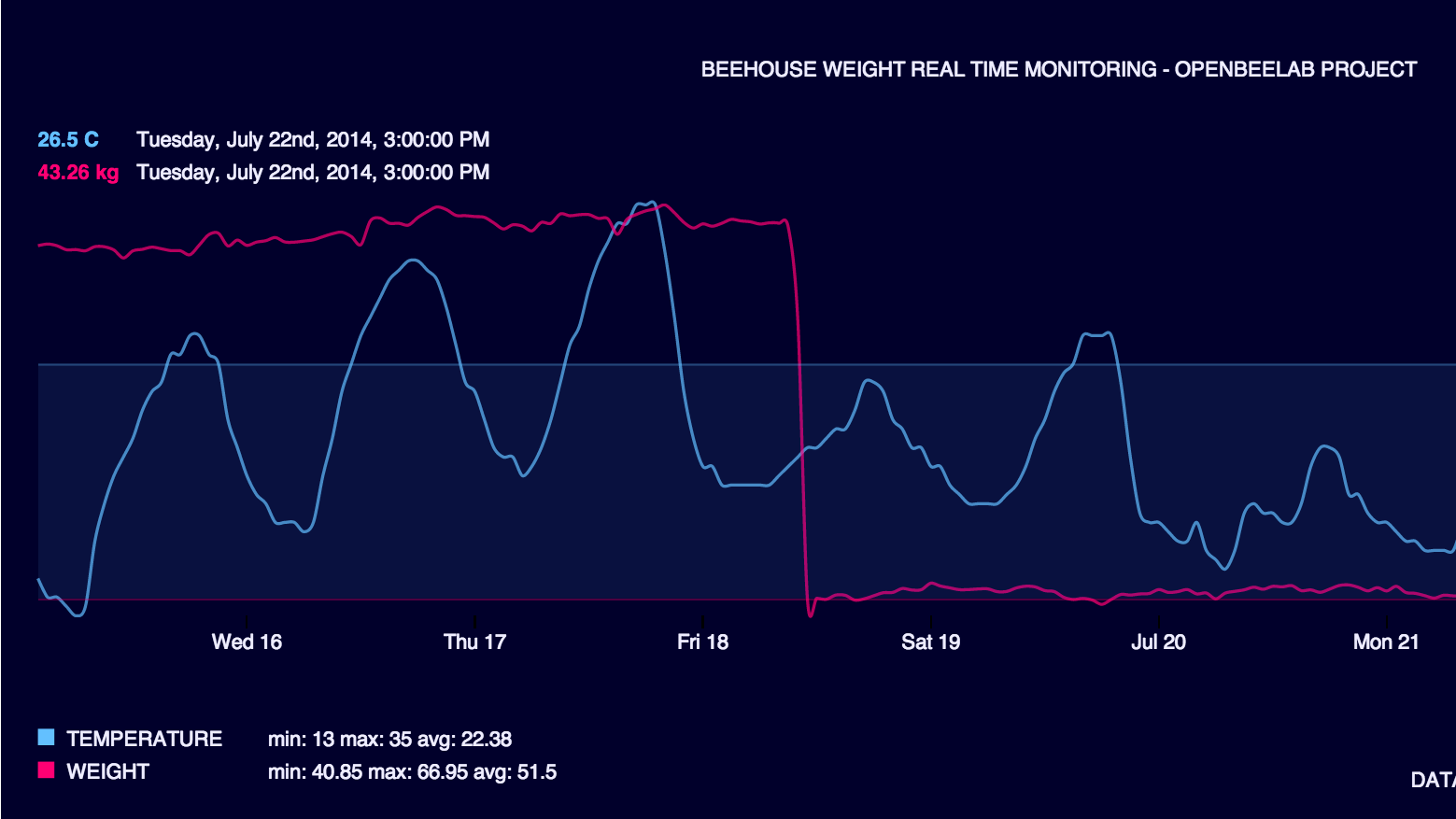
Data comes in real time from a beehive monitoring system. We have beehive weight and temperature.
VISUALIZATION ENCODING
X / horizontal axis is time. There is 2 line for y: beehive weight and temperature. It is a typical time series visualization.
VISUALIZATION INTERACTION
On the mouse over the graph, for the current x axis position, a circle is shown on each line. Data value is updated.
TECHNOLOGIES
html, css, javascript, d3js, elasticsearch, couchdb, nodejs, api calls.
STORY
This dynamic chart is integrated into a dashboard. Some helpers with mouse hover give ints on data.
Thats not so standard visualization. You can design colors, transparency, line thickness..
...and many other choices will make your line chart unique.