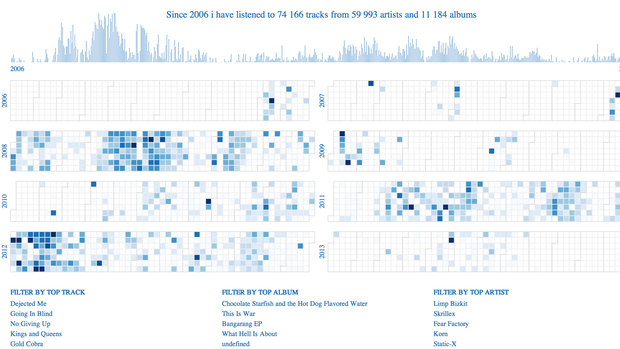
Interactive visualization
Activating filters will impact the visualisation in realtime.
Calls to the elasticsearch backend provide realtime analytics very fast and visuals are updated instantly.
DATA
Dataset comes from last.fm api. It is my listening history over 8 years. Each event is a track i listen to at a specific day and time, for an artist, album and track title.
VISUALIZATION ENCODING
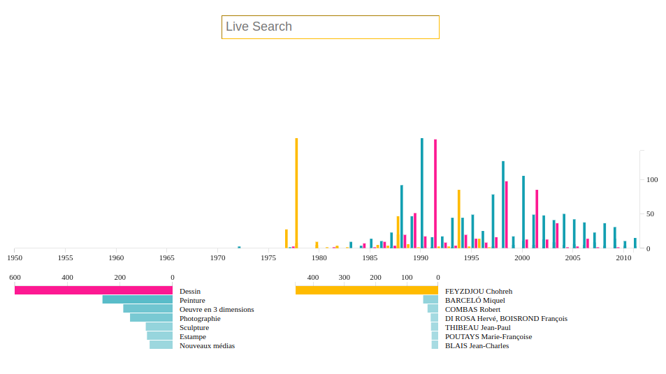
Top histogram is the count repartition of tracks listened over time.
In the middle there is 6 calendars per years. Each square cell is colored with the number of listens this day. The more i listen music, the more the cell is filled darked.
At the bottom you have facets. This is the top track / album / artist i listen to by frequency.
VISUALIZATION INTERACTION
Facets are interactives. When clicked it filters the whole visualisation dataset. Histogram and calendars are updated in real time.
TECHNOLOGIES
html, css, javascript, d3js, elasticsearch.
STORY
Calendar visualization by years of my listening history. A global histogram shows evolution by time for all years. Calendar cells density is related to listening count for this day.
This visualisation is interactive, you can filter by track/artist. It will update calendar and histogram in real time.
I really like the calendar view. We do not see it often but its really connected to our inner vision of our time schedule.